Saturday, July 10, 2010

THE REPSOL INDONESIA!


Thats it!

See you in the next assignment!

THE MAKING (FINISHED)!

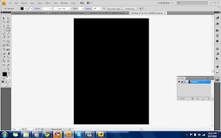
So started my new logo by making the black background since I have a white color in the logo. So I used Rectangle Tool to cover the background with Black color.
Layer1.jpeg

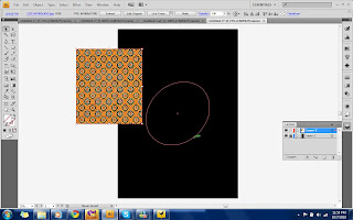
The second step was, I placed a BATIK picture and create an Oval shape by using Ellipse Tool.
layer2a.jpeg

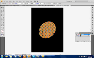
and then, still in layer 2, I mixed the picture and the oval by doing Clipping Mask.
layer2b.jpeg

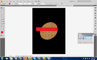
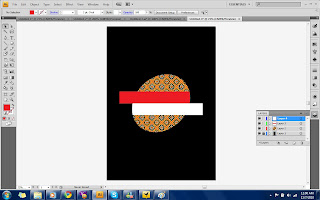
Next I put the Red block by using Rectangle Tool.
layer3.jpeg

I did the same to the second block but this time its White.
layer4.jpeg

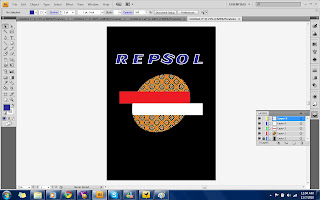
The last part was to type the name "REPSOL" by using Type Tool.
layer5.jpeg

So it is DONE!
The Indonesian Repsol!

THE SKETCH!


So I am ready with the sketch of the new REPSOL logo.
Here you go:

Legend:
A : It was originally ORANGE at the top and RED at the bottom. But I chose to fill it with BATIK to add some of my country culture.
B : In the original logo, it is ORANGE. But I change it to RED in order to add more Indonesian effect to the logo.
C : This block is originally WHITE. And I keep it white so it match the upper block so it will be RED and WHITE.
D : It is the name of its company so I won't do much editing on this. Just keep it as it is.

That is all of my sketch and plan, hopefully I could make it in the Ai.

Sayonara!

THE LOGO HAS BEEN CHOSEN!


And the lucky one is...........

Yeah! I chose REPSOL to redesign!

NEXT...!! My sketch of the NEW REPSOL!

Assignment 1 - Redesigning a Logo

So this is the first Assignment of Computer Graphic 1 for me.
Basically we have to redesign any INTERNATIONAL LOGO and put some of our LOCAL CULTURE in it.

The requirements are:


1) Ideation must first be drawn. In other words, you are to draw your idea on paper first prior doing it in Illustrator. The process of ideation to final output must be documented on a blog or web log that all students must create.

2) The logo should be made out of shapes only. It should be based on a known international logo. No text, no human or animals symbols. Just plain shapes.You need not follow the original shape of the original logo. You can change it just as long they have meaning in the local context.

However, you are NOT allowed to change the name of the original company. For example, if you choose Burger King logo, you can change the Shape and colour to fit local culture but you cannot change the name of the company to Raja Burger.

3) The logo should be in colour. The colour should have meaning to the logo based on local culture and local meaning.

4) Size of the symbol – A4

6) Printout the symbol and mount it on an A3 mounting board.

7) The other side of the mounting board must contain a write-up page. The write-up page must contain - the title of the logo, the meaning of the logo in local or cultural context, the meaning of the shape and the meaning of the colour and the relation to what the company represents.

8) Include your name, ID and group at the back of the mounting board.

That is it for the description.

See you in the next post.